Recipe - Post Flight Analysis
This is an example for what the post flight analysis for a typical FAAM chemistry flight could look like.
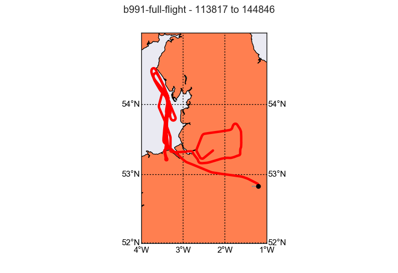
The data we are using are from the “Into the Blue” flight b991 on the 24th October 2016. This flight took us up and down the west coast between Morecambe and Wales. On that stretch some “plumes” were sampled, that originated from the Manchester/Liverpool area.
Warning
All the provided chemistry data in the example dataset are preliminary and uncalibrated. Therefore the data are not suitable for scientific publication.
Getting Started
At the start we need to import a number of modules and define a few variables that we need in later steps.
import datetime
import os
import numpy as np
import pandas as pd
import matplotlib.pyplot as plt

import faampy
from faampy.core.faam_data import FAAM_Dataset

year, month, day = 2016, 10, 24
FID = 'b991'

core_file = os.path.join(faampy.FAAMPY_EXAMPLE_DATA_PATH,
                         'b991',
                         'core',
                         'core_faam_20161024_v004_r0_b991.nc')

fltsumm_file = os.path.join(faampy.FAAMPY_EXAMPLE_DATA_PATH,
                            'b991',
                            'core',
                            'flight-sum_faam_20161024_r0_b991.txt')
Reading in data from the different chemistry instruments.
# define the input data file
nox_file = os.path.join(faampy.FAAMPY_EXAMPLE_DATA_PATH,
                        'b991',
                        'chem_data',
                        'NOx_161024_090507')

# defining the function that calculates the timestamp
nox_dateparse = lambda x: pd.datetime(year, month, day) + \
      datetime.timedelta(seconds=int(float(float(x) % 1)*86400.))

df_nox = pd.read_csv(nox_file, parse_dates=[0], date_parser=nox_dateparse)
df_nox = df_nox.set_index('TheTime')  # Setting index
t = df_nox.index.values
df_nox['timestamp'] = t.astype('datetime64[s]')  # Converting index data type
df_nox = df_nox[['timestamp', 'no_conc', 'no2_conc', 'nox_conc']]
df_nox[df_nox < 0] = np.nan

# Now the FGGA data
from faampy.data_io.chem import read_fgga
fgga_file = os.path.join(faampy.FAAMPY_EXAMPLE_DATA_PATH,
                         'b991',
                         'chem_data',
                         'FGGA_20161024_092223_B991.txt')

df_fgga = read_fgga(fgga_file)

# Using the valve states for flagging out calibration periods
df_fgga.loc[df_fgga['V1'] != 0, 'ch4_ppb'] = np.nan
df_fgga.loc[df_fgga['V2'] != 0, 'co2_ppm'] = np.nan
df_fgga.loc[df_fgga['V2'] != 0, 'ch4_ppb'] = np.nan


# Last but not least: Reading in the FAAM core data file using the FAAM_Dataset
# object from the faampy module

ds = FAAM_Dataset(core_file)
Merge the data different datasets.
# merge chemistry data with the core data set
# The delay keyword is used to set off the chemistry measurements. Due to the
# fact that the air has to travel through tubings in the cabine those
# instruments are slower than e.g compared to the temperature measurements
ds.merge(df_nox.to_records(convert_datetime64=False),
         index='timestamp', delay=3)
ds.merge(df_fgga.to_records(convert_datetime64=False),
         index='timestamp', delay=4)

# define variable list, that we like to extract
var_list = ['Time', 'LAT_GIN', 'LON_GIN', 'ALT_GIN', 'HGT_RADR',
            'CO_AERO', 'U_C', 'V_C', 'W_C', 'U_NOTURB', 'V_NOTURB',
            'WOW_IND', 'TAT_DI_R', 'TDEW_GE', 'PS_RVSM', 'ch4_ppb', 'co2_ppm',
            'no_conc', 'no2_conc', 'nox_conc', 'TSC_BLUU', 'TSC_GRNU',
            'TSC_REDU', 'BSC_BLUU', 'BSC_GRNU', 'BSC_REDU', 'IAS_RVSM']

# write the netcdf out to you HOME directory
outfile = os.path.join(os.path.expanduser('~'), '%s_merged.nc' % (FID.lower()))
print('Written ... %s' % (outfile,))
ds.write(outfile,
         clobber=True,
         v_name_list=var_list)
Google-Earth overlays
The commands in this section are run from the konsole. To keep the filenames short we move into the directory where the data for b991 are located:
cd ~/faampy_data/example_data/b991
We create a gpx (GPS Exchange Format) file:
faampy nc_to_gpx core/core_faam_20161024_v004_r0_b991.nc .
We use the gpx data file to geotag a few photographs that were taking during the flight. The gpscorrelate utility can be installed from the linux distribution package manager:
gpscorrelate --gps b991_20161024.gpx --photooffset -3600 photos/*jpg
Now that the photos are geotagged it is possible to create a photo album:
faampy ge_photo_album ./photos ./ge_photo_album_20161024_b991.kmz
WAS (Whole Air Sample) bottle overlay:
faampy ge_was_to_kmz ./chem_data/B991.WAS ./core/core_faam_20161024_v004_r0_b991_1hz.nc .
Now make profiles for some of the variables in the created merged file.
from faampy.mapping import ge_ncvar_to_kml

# We are now continuing to work with the merged data file, that was produced
# in the previous step

core_file2 = os.path.join(os.path.expanduser('~'),
                          '%s_merged.nc' % (FID.lower()))

opath = os.path.expanduser('~')

ge_ncvar_to_kml.process(core_file2, 'CO_AERO', 0, -100, 500, opath)
ge_ncvar_to_kml.process(core_file2, 'co2_ppm', 0, -435, 1500, opath)
ge_ncvar_to_kml.process(core_file2, 'ch4_ppb', 0, -2115, 500, opath)
Quicklook Figures
faampy provides a tool to create quicklook figures using information from the flight summary. According to the event name (e.g. Profile, Run, …) either a time series or a profile plot is produced. Maps are created for every event and tephigrams for every profile.
import faampy.plotting.quicklooks as q

Plot_Config = [[['TSC_BLUU', 'TSC_GRNU', 'TSC_REDU'],
                ['BSC_BLUU', 'BSC_GRNU', 'BSC_REDU']],
               [['CO_AERO'],],
               [['ch4_ppb'], ['co2_ppm']],
               [['no_conc'], ['no2_conc'], ['nox_conc']]]

# define the outpath, where all the figures should be saved to
quicklooks_outpath = os.path.join(os.path.expanduser('~'), 'b991_quicklooks')

# Check if directory exists; if not create it
if not os.path.exists(quicklooks_outpath):
    os.makedirs(quicklooks_outpath)
    print('Directory created: %s ...' % (quicklooks_outpath))

b991_qlooks = q.Quicklooks(fltsumm_file,
                           core_file2,
                           quicklooks_outpath)

# Set-up the plot configuration
b991_qlooks.Plot_Config = Plot_Config
b991_qlooks.process()
Make the output directory for the quicklook figure files:
mkdir ~/b991_quicklooks
The quicklook tool is also available from the command line. First create a quicklooks configuration file (quicklooks.cfg) which defines the figure layout:
touch quicklooks.cfg
Add the following text to the quicklooks.cfg file using a text editor:
[['TSC_BLUU', 'TSC_GRNU' , 'TSC_REDU'], ['BSC_BLUU', 'BSC_GRNU', 'BSC_REDU']]
[['CO_AERO'],]
[['ch4_ppb'], ['co2_ppm']]
[['no_conc'], ['no2_conc'], ['nox_conc']]
Every line defines one figure and the number of subplots. For example the first line ([[‘TSC_BLUU’, ‘TSC_GRNU’ , ‘TSC_REDU’], [‘BSC_BLUU’, ‘BSC_GRNU’, ‘BSC_REDU’]]) will create two subplots. In the 1st of these the total scatter values from the Nephelometer will be plotted and in the 2nd subplot the backscatter values will be plotted.
We will use the merged data file, which we produced in the previous section. This file contains the NOx and FGGA data. The command for creating the quicklooks is:
faampy plt_quicklooks --config_file quicklooks.cfg b991_merged.nc \
  ./core/flight-sum_faam_20161024_r0_b991.txt ~/b991_quicklooks/
If the above commmand was successful the figures should have been created in the b991_quicklooks directory in your home directory.
Coloured Line Figure
import numpy as np
import cartopy.crs as ccrs
import matplotlib.pyplot as plt
import os
from matplotlib.collections import LineCollection

from faampy.core.faam_data import FAAM_Dataset

cities = [('Liverpool',  53.410565, -2.992983),
          ('Manchester', 53.484538, -2.242493),
          ('Blackpool',  53.817770, -3.035729),
          ('Preston',    53.763530, -2.703519),
          ('Southport',  53.648671, -3.007051),
          ('Blackburn',  53.748788, -2.488308)]

### SETTINGS ##################################################################

# Define map extent
ymin = 53.2
ymax = 54.0
xmin = -3.5
xmax = -2.0

FID = 'b991'
year, month, day = 2016, 10, 24


_RUNS = [('Run 2@100ft',  '121217', '122142'),
         ('Run 3@500ft',  '122257', '122937'),
         ('Run 4@1000ft', '123134', '124152'),
         ('Run 5@1000ft', '124305', '125133')]

_run = _RUNS[0]

# The Variable name that we want to plot
VARIABLE_NAME = 'nox_conc'
# Range for the chemical that we are interested in
rng = (0, 30000)

###############################################################################


#http://nbviewer.jupyter.org/github/dpsanders/matplotlib-examples/blob/master/colorline.ipynb
def colorline(x, y, z=None, cmap=plt.get_cmap('copper'),
              norm=plt.Normalize(0.0, 1.0), linewidth=3, alpha=1.0):
    """
    Plot a colored line with coordinates x and y
    Optionally specify colors in the array z
    Optionally specify a colormap, a norm function and a line width
    """

    # Default colors equally spaced on [0,1]:
    if z is None:
        z = np.linspace(0.0, 1.0, len(x))

    z = np.asarray(z)

    segments = make_segments(x, y)
    lc = LineCollection(segments, array=z, cmap=cmap, norm=norm, \
                        linewidth=linewidth, alpha=alpha)
    ax = plt.gca()
    ax.add_collection(lc)
    return lc


def make_segments(x, y):
    """
    Create list of line segments from x and y coordinates, in the correct
    format for LineCollection:
    an array of the form   numlines x (points per line) x 2 (x and y) array
    """
    points = np.array([x, y]).T.reshape(-1, 1, 2)
    segments = np.concatenate([points[:-1], points[1:]], axis=1)
    return segments


# Read in the merged data file
core_file2 = os.path.join(os.path.expanduser('~'), '%s_merged.nc' % (FID.lower()))
ds = FAAM_Dataset(core_file2)
# Get the data as a pandas dataframe
df = ds.as_dataframe()

# set up the map
wgs84 = ccrs.PlateCarree() #  we need this for transforming data points
proj = ccrs.OSGB()  # this is the standard map projection for Great Britain
ax = plt.axes(projection=proj)
ax.set_extent([xmin, xmax, ymin, ymax])
ax.coastlines(resolution='10m', color='black', linewidth=1)

# add the cities as dots to the map
for city in cities:
    x, y = proj.transform_point(city[2], city[1], wgs84)
    ax.scatter(x, y, color='grey')
    ax.text(x, y, city[0], horizontalalignment='right')

# convert from GPS coordinates (WGS84) to OSGB
coords = proj.transform_points(wgs84,
                               df['LON_GIN'].values,
                               df['LAT_GIN'].values)
x = coords[:,0]
y = coords[:,1]

z = df[VARIABLE_NAME].values

# extract the data for the run
start_time = datetime.datetime(year, month, day,
                               int(_run[1][0:2]),
                               int(_run[1][2:4]),
                               int(_run[1][4:6]))
end_time = datetime.datetime(year, month, day,
                             int(_run[2][0:2]),
                             int(_run[2][2:4]),
                             int(_run[2][4:6]))

ixs = [np.where(df.index == start_time)[0][0],
       np.where(df.index == end_time)[0][0]]

x = x[ixs[0]:ixs[1]]
y = y[ixs[0]:ixs[1]]
z = z[ixs[0]:ixs[1]]

#http://matplotlib.org/examples/pylab_examples/multicolored_line.html
lc = colorline(x, y, z=z,
               cmap=plt.get_cmap('gnuplot2'),
               norm=plt.Normalize(rng[0], rng[1]),
               linewidth=5)

# No the wind barbs
# Reduce the number of data points by averaging the data; otherwise
# the plot will look messy
df_30s = df[ixs[0]:ixs[1]].resample('30s').mean()

# calculate the coords for the figure
coords = proj.transform_points(wgs84,
                               df_30s['LON_GIN'].values,
                               df_30s['LAT_GIN'].values)
x = coords[:,0]
y = coords[:,1]

u, v = (df_30s['U_C'].values, df_30s['V_C'].values)

# finally plot the wind barbs
plt.barbs(x, y, u, v,
          length=7,
          barbcolor='k',
          flagcolor='k',
          linewidth=0.5,
          zorder=2)

# add a colorbar to the plot
cb = plt.colorbar(lc, label="NOx (ppt)")

ax.set_title(_run[0])
Transect Figure
import matplotlib.gridspec as gridspec

# seaborn changes the plot layout
try:
    import seaborn
except:
    pass

# Figure layout set up
# 4 rows 1 column and all figures should share the x-axis
gs = gridspec.GridSpec(4, 1)
fig = plt.figure()
fig.add_subplot(gs[3,:])
fig.add_subplot(gs[2,:], sharex=fig.get_axes()[0])
fig.add_subplot(gs[1,:], sharex=fig.get_axes()[0])
fig.add_subplot(gs[0,:], sharex=fig.get_axes()[0])


# Loop over the runs
for i, _run in list(enumerate(_RUNS)):
    print('%i: %s' % (i, _run[0]))
    ixs = (datetime.datetime(year, month, day,
                             int(_run[1][0:2]),
                             int(_run[1][2:4]),
                             int(_run[1][4:6])),
           datetime.datetime(year, month, day,
                             int(_run[2][0:2]),
                             int(_run[2][2:4]),
                             int(_run[2][4:6])))

    df_extracted=df[list(df.index.to_pydatetime()).index(ixs[0]):\
                    list(df.index.to_pydatetime()).index(ixs[1])]

    plt.sca(fig.get_axes()[0])
    ax = plt.gca()
    plt.plot(df_extracted.LAT_GIN.values,
             df_extracted.nox_conc.values,
             label=_run[0], lw=3)
    plt.xlabel('Latitude')
    plt.ylabel(r"NOx (ppt)")
    plt.grid()

    plt.sca(fig.get_axes()[1])
    ax = plt.gca()
    plt.setp(ax.get_xticklabels(), visible=False) # remove the xtick labels
    plt.plot(df_extracted.LAT_GIN.values,
             df_extracted.ch4_ppb.values,
             label=_run[0], lw=3)
    plt.ylabel(r"CH4 (ppb)")

    plt.sca(fig.get_axes()[2])
    ax = plt.gca()
    plt.setp(ax.get_xticklabels(), visible=False)
    plt.plot(df_extracted.LAT_GIN.values,
             df_extracted.co2_ppm.values,
             label=_run[0], lw=3)
    plt.ylabel(r"CO2 (ppm)")

    plt.sca(fig.get_axes()[3])
    ax = plt.gca()
    plt.setp(ax.get_xticklabels(), visible=False)
    plt.plot(df_extracted.LAT_GIN.values,
             df_extracted.CO_AERO.values,
             label=_run[0], lw=3)
    plt.ylabel(r"CO (ppb)")
    ax.set_ylim(150, 260)
    plt.legend()

# adjust the x-axis limits
plt.xlim(53.3, 53.9)

plt.tight_layout()